
Summary
The Osaka Japanese Steakhouse Mobile Website aimed to update the user interface, branding, and visual design while also making the website much more usable on mobile devices for potential restaurant customers.
TIMELINE
July 2023 - August 2023
PROBLEM
Current website design not up to restaurant’s expectations
The restaurant owners of Osaka Japanese Steakhouse felt that the restaurant website was not up to par and was holding the business back on potential new customers and revenue. Although it seemed like they were just looking for a visual refresh, I thought there were a lot of opportunities for improving the user experience.


SOLUTION
Osaka Japanese Steakhouse’s previous website on desktop (left) and mobile (right)
USER INTERVIEWS
Websites are the first impression for new customers, which can make or break a restaurant visit
USER SURVEYS


64% of users go onto a restaurant website to view the menu
To further validate these insights, as well as discover how users interact with a restaurant website and what aspects were the most important to focus on, I conducted a survey and collected 11 responses. I found that a large majority view restaurant websites for the menu and on mobile devices more than desktop, meaning I needed to put my focus on these two features of the website. Emphasis on images of food is also critical to increasing restaurant visits.
DESIGN

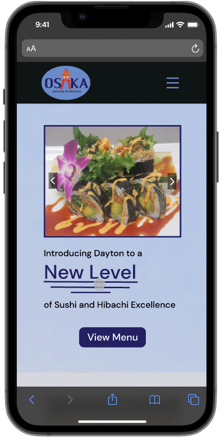
ITERATION TESTING + IMPROVEMENTS
Iterating on visibility, navigation, and labels
Through unmoderated testing/feedback from 4 users, I continued to iterate on my designs.


Inadequate visual design and lack of mobile-friendliness can discourage customers from ordering food
ROLE
To start, I decided to flip the problem on its head and figure out why customers might have issues with a restaurant website. I explored reasons why new restaurant customers might not like or might be discouraged from trying out a restaurant based on their website. I managed to uncover two key insights based on a survey done by MGH, a full-service marketing communications agency:


UX Designer, Front End Developer
LITERATURE REVIEW
Although I already had insights on what’s important about a restaurant website, I wanted to break it down into why these aspects were important. I interviewed 5 people who look at a restaurant website before visiting for the first time not only to discover these reasonings, but also to validate my findings above.


I created the color palette around the logo’s purple and light blue colors, adding grays, white, and a subtle black to contribute to a more professional look of the website. For the text, I decided to use the sans-serif font ‘DM Sans’ for its readability and its professional feel throughout the site.


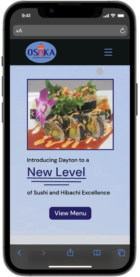
FINAL SCREENS
Website available at osakasteakhouseoh.com
REFLECTIONS


“COMPETITIVE” ANALYSIS
Learning from other restaurant websites’ layout and design elements
With insights on what to prioritize on our restaurant website, I wanted to look at some examples of mobile restaurant websites that had well-organized layout and navigation. I also wanted to take a look at what they did well to establish brand identity, as I didn’t have much insight on that up to this point.

UPDATED PROBLEM STATEMENT
How might we update the restaurant’s mobile website to create easier navigation and a more convincing brand identity to convince customers to visit?
USER PERSONA
Meet Ben, a seasoned website restaurant researcher

INFORMATION ARCHITECTURE
Tweaking the structure of the restaurant’s website
Outlining the information architecture of the new website helped me figure out the content being added to each page. Although most content of a restaurant website is more about conveying the restaurant's personality and branding than providing strictly necessary information, I did want to incorporate more menu buttons, as well as the business hours and contact information on each page.

Future Iterations
I would’ve loved to incorporate an ‘Order Takeout’ button that opens up a page with the links from where you can order takeout. I didn’t have enough time for thorough research for the implementation, but I would’ve loved to incorporate the feature.
Difficulty determining real impact
It was hard to determine the real impact of the website redesign, as I had no data from how the previous website performed. For future projects, I would definitely want to collect data from the website or app’s current performance to ensure that my final solution is effective and has a positive impact.